Apache Royale v0.9.8 released!
The Apache Royale community is pleased to announce the release of Apache Royale 0.9.8.
The Apache Royale project is the next generation of the Apache Flex SDK. It lets developers use MXML and ActionScript 3 to generate HTML/JS/CSS applications which can run natively in browsers. The cross-compiled code can also run on platforms like Electron or Apache Cordova (Adobe PhoneGap) to build mobile applications.
This release should be considered 'beta' quality, although we're very close to a 1.0 release and we have many applications in production at this point. The purpose of this release is to continue to gather feedback about Royale's features and the project's implementation strategies, and to recruit new contributors. We hope to grow the code base into an SDK and tool chain that delivers the highest productivity when developing applications that can run on many platforms. Beta releases, however, may not handle all production needs.
Changes in 0.9.8:
Apache Royale Framework 0.9.8
- Core
- Added getClassStyle function that get an Object with all styles in a CSS className.
- Basic
- Move getParentEventTarget() from EventDispatcher to UIBase to reduce require dependencies. This allows EventDispatcher to be used in non-GUI contexts, such as Node.js.
- UIBase, added loadBeads hook method
- Added BrowserResizeListener bead that listen for browser resizing and resizes a component accordingly. Old one was renamed to "BrowserResizeApplicationListener"
- StyledUIBase & ClassSelectorListSupport, added replaceClass method
- Added ILabelFunction and LabelFunction bead
- Added LayoutChildren: A bead to trigger layout in children. Added support in StyledLayoutBase.
- Added interfaces for better extension in Basic and Jewel: IColumns, ITableModel, ITableView, ITextButton, IPaddings, IPositioning
- Paddings: New bead to add padding in mxml to a component
- Positioning: New bead to add positioning in mxml to a component
- Add SelectionDataItemRendererFactoryForCollectionView to handle ISelectionModel for components that uses selection and add/remove/update items at runtime.
- RoyaleUnit
- Fixed issue where CIListener incorrectly escaped quotes in messages.
- Better error messages when
[BeforeClass]or[AfterClass]is detected, but method is not found by reflection.
- Jewel
- ASDocs: multiple refactors in many components to document and describe better components
- Item Renderers
- Refactor to make Basic Layout the default (before was horizontal baked)
- Initializers now use new Paddings bead. Create a default if no one is found.
- Remove then minimum height of 34px, so we can have renderers with less height
- New BinaryImage component
- Card:
- New CardExpandedContent: Used for content that needs to avoid paddings like navigation bars
- Button, CheckBox, RadioButton:
- add "spanLabel" to separate the text from other decorations like icons and get more control over styling
- Image added "loadComplete" event
- New ClipImage bead for images to allow clipping
- New ErrorImage beads
- Added SimpleLoader component that show an indeterminate spin circle
- DataContainer
- dataProvider is now the DefaultProperty
- List
- Added label function through beads
- New ListAlternateRowColor bead (should be temporal until get nth-child css styles work in compiler)
- dataProvider is now the DefaultProperty
- Fixes on SearchFilterForList
- ComboBox:
- Fix Sizing issues
- Improve open popup faster
- new ComboBoxItemByField bead that allows to select an item by field
- dataProvider is now the DefaultProperty
- add item renderer support at mxml (TLC) level
- Fixes on SearchFilter
- DateField:
- Fix Sizing issues
- TabBar:
- Multiple refactors to decouple functionality in beads and make renderers more flexible. Now we allow vertical layouts and indicator in renderer can be positiones in different places
- Add "sameWidths" to make all buttons share the same width.
- dataProvider is now the DefaultProperty
- Table
- Refactor to get better scrolling and fixed header
- Added label function through beads
- New TableAlternateRowColor bead
- Solve RTE when set columns at runtime
- Added Initializer
- New TableAlternateRowColor bead (should be temporal until get nth-child css styles work in compiler)
- Removed CRUD beads and added new CRUDTableItemRendererFactoryForCollectionView
- DataGrid
- Multiple fixes in column dimensions to allow more configurations
- Added sorting through DataGridSortBead
- Added swap of columns
- Added label function through beads
- dataProvider is now the DefaultProperty
- add item renderer support at mxml (TLC) level
- PresentationModels refactor for List and DataGrid based controls to allow more flexibility
- NumericStepper:
- Fix Sizing Issues
- New responsive beads: ResponsiveSize, ResponsiveResizeListener and ResponsiveLabelVisibility
- New TileHorizontalLayout and TileVerticalLayout beads
- New ViewLayout for View
- Removed Jewel ControlBar since it was just an HGroup
- Jewel Themes:
- Lots of changes to accommodate the rest of component development and fixes in jewel
- Add fluid text sizing responsiveness, so size of text shrinks or grows depending on device to fit on different screens
- Start of VirtualDataGrid component (still has some issues)
- Collections
- ArrayList.length now is bindable
- Maven Distribtuon:
- The distributions built by Maven should now be equivalent to those of the Ant build.
- Maven Archetypes:
- updated royale-simple-application-archetype
- new new royale-jewel-application-archetype
- new new royale-jewel-module-application-archetype
- new new royale-jewel-crux-application-archetype
- Dozens of bugs reported, investigated, and squashed. For details of closed bug reports see GitHub Issues list.
Updates to the RELEASE_NOTES made after this file was packaged into the release artifacts can be found here:
https://github.com/apache/royale-asjs/wiki/Release-Notes-0.9.8
Apache Royale Compiler 0.9.8
- Fixed issue where problems in .mxml files were sometimes duplicated.
- Fixed issue where unrecognized characters in .mxml files were sometimes ignored, and now an error is reported.
- Fixed some missing syntax checks for bindable variables that should have been the same as non-bindable variables. This may produce some new errors that weren't there before (such as duplicate variable names), but they should have been.
- Fixed issue where a type annotation referencing a class with a private constructor was not correctly resolved.
- Improvements/Fixes in Binding support, added support for binding inheritance, similar to Flex.
- (JS) Source map debugging paths of SDK classes are updated to allow breakpoints in the original .as or .mxml files in the SDK when debugging in a browser or IDE.
- (JS) Added source-map-source-root compiler option to optionally customize the source root of source maps.
- (JS) No longer generates @export annotations for exported symbols in debug builds. Exports are smartly generated when creating a release build, and if they are disabled, they will be omitted from framework classes now too. This can help reduce the size of a release build.
- (JS) Fixed issue where compiling a .swc library with another .swc library on the library-path did not copy the required .js files to the new .swc library. Only when a .swc library is added external-library-path should the .js files not get copied.
- (JS) Improved reproducible builds of .swc library files by ensuring that the paths to .js.map source map files are always referenced with forward slash and never backslash. This matches the existing behavior of references to .js files included with .swc libraries.
- (JS) Static getters/setters are not accessed with
["name"]syntax in generated JavaScript anymore, which required them to always be exported, even if the associated export symbols compiler option were disabled. - (JS) When internal namespace is used in ActionScript, the generated JavaScript adds the @package annotation.
- (JS) Fixed issue where the Language class was not loaded in the correct order when type coersion is required in a static initializer.
- (JS) (Advanced) Added export-internal-symbols and prevent-rename-internal-symbols compiler options to match the existing options for public and protected namespaces.
- (JS) (Advanced) Added prevent-rename-public-static-methods, prevent-rename-public-instance-methods, prevent-rename-public-static-variables, prevent-rename-public-instance-variables, prevent-rename-public-static-accessors, and prevent-rename-public-instance-accessors compiler options to provide more granular control when prevent-rename-public-symbols is true (same for protected and internal namespaces too).
For additional information on recent issues that have been closed, see Github Issues List
You can download a binary distribution, the source code or browse our GitHub repositories. If you're a NPM user you can check Apache Royale at NPM.
As well, you can help us filing bug reports for issues you encounter in the framework or compiler.
For questions about how to use Royale, send email to mailto:users@royale.apache.org. For questions and feedback on the development of the source code in the release, send email to dev@royale.apache.org.
Enjoy! 🙂
Royale at ApacheCon 2020
The Apache Software Foundation (ASF) held its annual convention, ApacheCon, September 29-October 1, 2020. Because of the pandemic, it was an all-virtual conference. Participants logged in and attended keynote speeches, track sessions, and informal hallway meetings from all around the world. The conference had a track in Mandarin, and sessions in Hindi.
Attendance broke all previous records, with over three thousand people taking part. Over 80% were attending their first-ever ASF convention.
There were 27 presentation tracks, the largest number ever for ApacheCon. Apache Royale was among them, with presenters in Pakistan, Spain, and Canada.
The tracks were:
Hello, Royale!: A high-level tour of what Apache Royale does, its history, and what it offers to people creating new applications or migrating existing Flex applications before the end of Flash support. (Video) (PDF)

Moving an App from Flex to Royale: What's involved in migrating a complex, business-critical application from Apache Flex and the Flash platform to Apache Royale. (Video) (PDF)

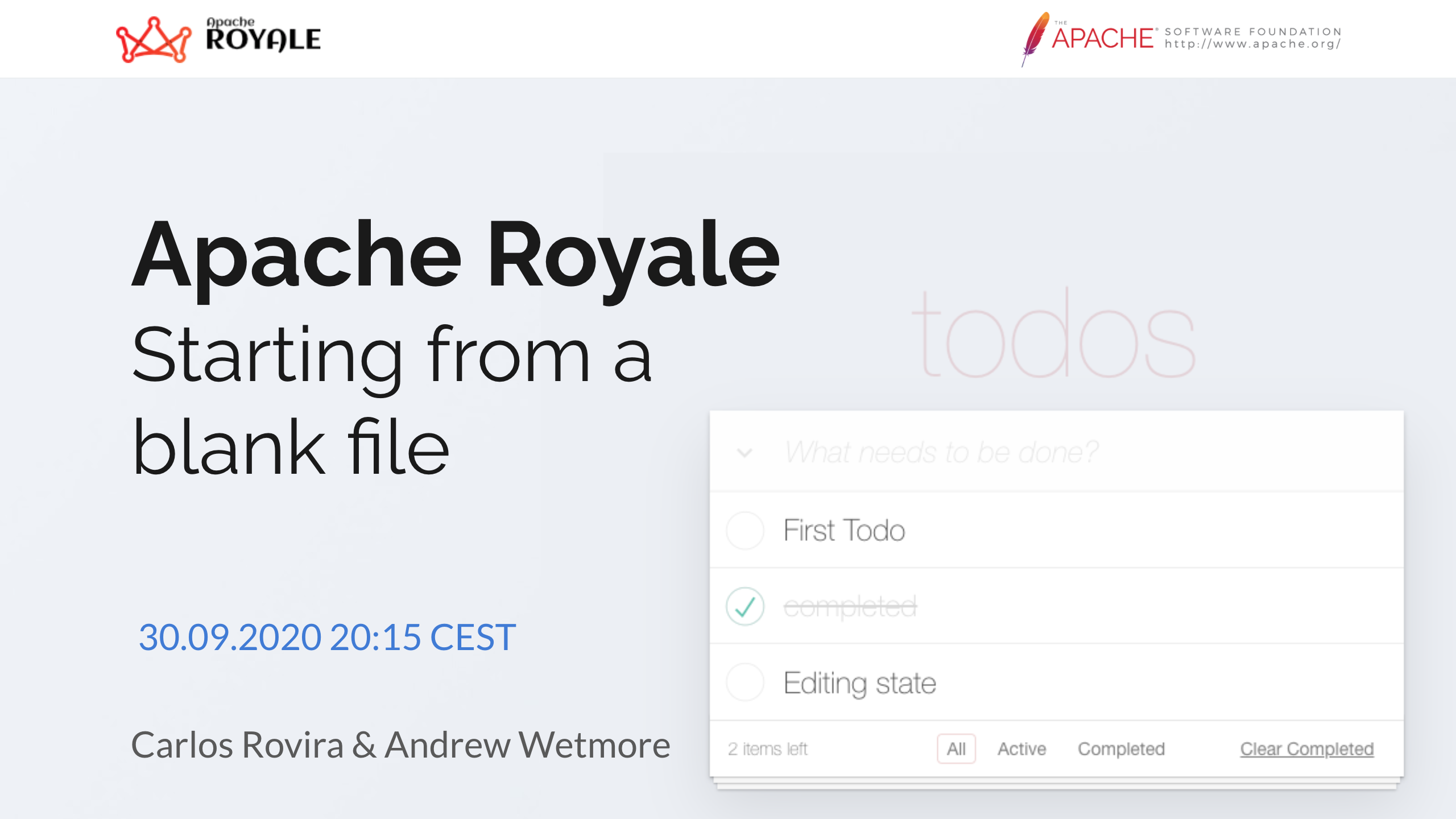
Starting from a blank file: A demonstration of creating a complex application from an empty file, using Royale's existing features and component sets. (Video) (PDF)
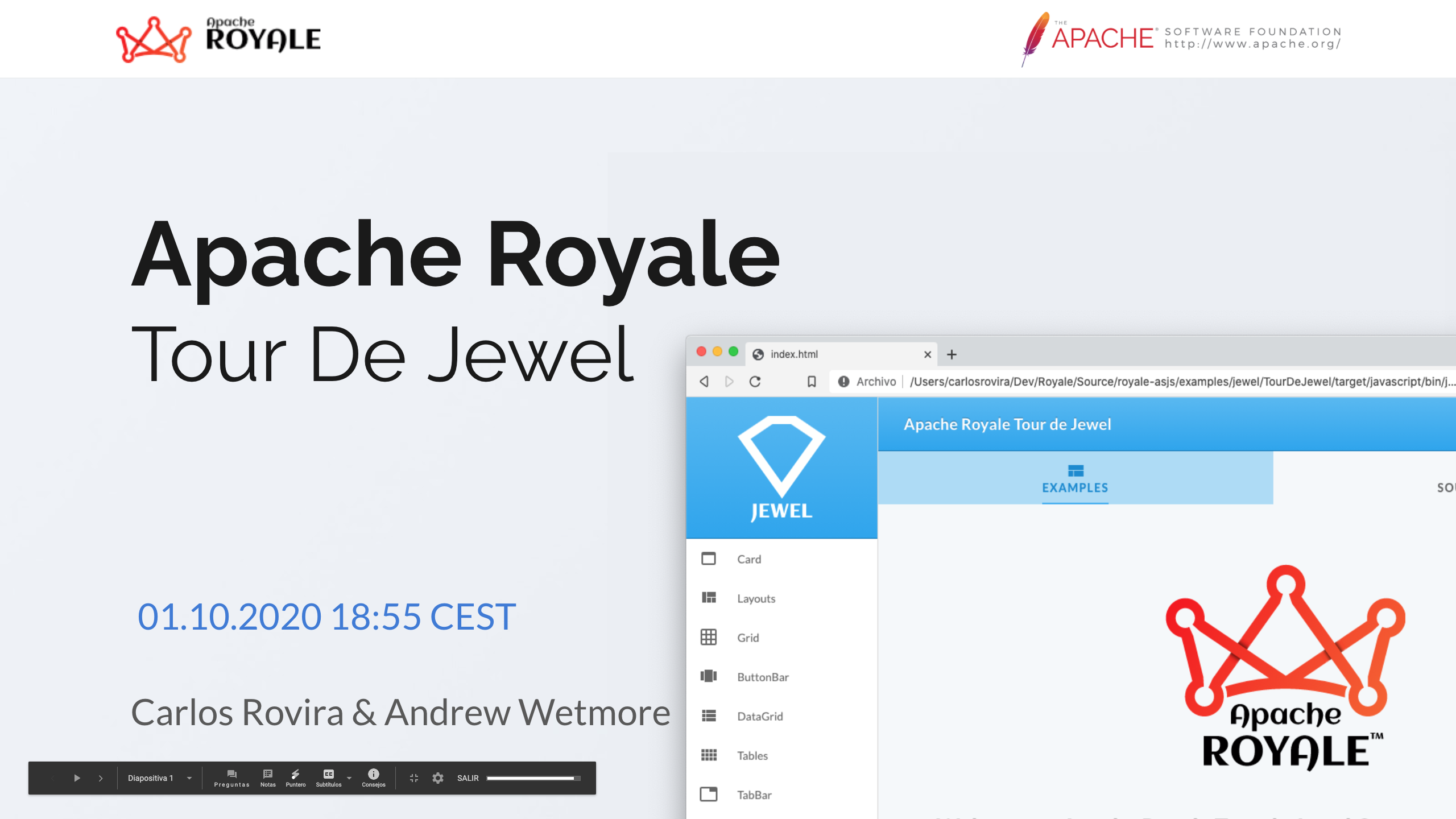
Tour de Jewel: A review and discussion of the Jewel component set, the most feature-rich of the component sets Royale provides. (Video) (PDF)
You can download and review PDFs of the four presentations or watch the videos of the presentations available on YouTube.
Using Jewel TileHorizontalLayout
This example shows how to use the Jewel TileHorizontalLayout in Jewel components and data-based containers to arrange child elements as tiles. The layout lets you customize the tiles' size, the gaps between tiles, and whether you want them organized by rows or columns.
This layout is modeled very closely on the Apache Flex Spark TileLayout.
Example structure
We're using the Jewel UI set to build a simple interface as a placeholder for the example. We use a Jewel Card in the middle of the screen. Inside the CardPrimaryContent we add a TabBarContent to switch between a Container and a DataContainer both using the TileHorizontalLayout to display child elements as tiles. We switch between the views using a TabBar inside a CardExpandedContent.
Use CardExpandedContent when we need the content adjusted to fit the Card borders without any gap. In our example, we want the TabBar to fill all the available space.
Adding the TabBar
We declare the TabBar using an inline ArrayList as dataProvider with the data to build each TabBarButton.
<j:CardExpandedContent>
    <j:TabBar localId="tabbar" width="100%" selectedIndex="0" sameWidths="true"
       itemRenderer="itemRenderers.TabBarVerticalIconItemRenderer">
        <js:ArrayList>
            <fx:Array>
                <vos:TabBarButtonVO label="Tile Container" hash="sec1" icon="{FontAwesome5IconType.TH_LARGE}"/>
                <vos:TabBarButtonVO label="Tile DataContainer" hash="sec2" icon="{FontAwesome5IconType.TH_LIST}"/>
            </fx:Array>
        </js:ArrayList>
    </j:TabBar>
</j:CardExpandedContent>
The Tabbar add two buttons to control the content that fills all available space (width is 100%). It makes both buttons the same width and puts the focus on the first one (selectedIndex = 0). The TabBarVerticalIconItemRenderer item renderer controls each button's layout. Check the full code to see details on configuring the renderer.
With this code in place we can add the content.
Add the dual TabBarContent
The main content is structured as follows:
<j:CardPrimaryContent>
    <j:TabBarContent selectedContent="{(tabbar.selectedItem as TabBarButtonVO).hash}">
        <j:SectionContent name="sec1">
            <j:Container width="100%">
                <!-- Content to show as tiles-->
            </j:Container>
        </j:SectionContent>

        <j:SectionContent name="sec2">
            <j:DataContainer width="100%" height="250">
                <!-- Content to show as tiles-->
            </j:DataContainer>
        </j:SectionContent>

    </j:TabBarContent>
</j:CardPrimaryContent>
The TabBarContent's selectedContent is bound to the TabBar's selectedItem so when a TabBar button is selected the content changes accordingly.
Using the tile layout in a Container
Inside the SectionContent we add a Container configured with TileHorizontalLayout. We can add any content we want to the container, but the size of each piece will be controlled by the layout.
Since no height is provided, no scrolling will be added as the number of content items increases or decreases, and the surrounding card will grow or shrink to adapt to them.
The layout is configured with some horizontal and vertical gaps, and we want three columns by default. This means that the width of the tiles will be calculated to fill all available space, taking into account the requestedColumnCount and the gaps:
<j:Container width="100%">
    <j:beads>
        <j:TileHorizontalLayout localId="thl" verticalGap="6"
            horizontalGap="6" requestedColumnCount="3"/>
    </j:beads>

    <html:Div className="box" text="1"/>
    <html:Div className="box" text="2"/>
    <html:Div className="box" text="3"/>
    <html:Div className="box" text="4"/>
    <html:Div className="box" text="5"/>
    <html:Div className="box" text="6"/>
    <html:Div className="box" text="7"/>
    <html:Div className="box" text="8"/>
    <html:Div className="box" text="9"/>
    <html:Div className="box" text="10"/>
    <html:Div className="box" text="11"/>
    <html:Div className="box" text="12"/>

</j:Container>
Using the tile layout in a DataContainer
Inside the SectionContent we add a DataContainer configured with the TileHorizontalLayout. As its name indicates, the content is generated dynamically based on the data in the ArrayList, and the item renderer controls the display of each tile.
You can use other data-based containers like a List if you need more functionality like selection of items, roll-over support or keyboard accessibility.
For this example, we limit the height of the container so the content can be hidden, and add scrolling with the ScrollingViewport bead.
Also we configure columnWidth and rowHeight so the columns will be calculated based on tile size and gaps.
<j:DataContainer width="100%" height="250"
    itemRenderer="itemRenderers.VerticalIconListItemRenderer">
    <j:beads>
        <j:ScrollingViewport/>
        <j:TileHorizontalLayout localId="thll" verticalGap="6"
                horizontalGap="6" columnWidth="130" rowHeight="70"/>
    </j:beads>

    <js:ArrayList>
        <fx:Array>
            <vos:IconListVO label="Ank" icon="{FontAwesome5IconType.ANKH}"/>
            <vos:IconListVO label="Atom" icon="{FontAwesome5IconType.ATOM}"/>
            <vos:IconListVO label="Burn" icon="{FontAwesome5IconType.BURN}"/>
            <vos:IconListVO label="Candy Cane" icon="{FontAwesome5IconType.CANDY_CANE}"/>
            <vos:IconListVO label="Fire" icon="{FontAwesome5IconType.FIRE_ALT}"/>
            <vos:IconListVO label="Duck" icon="{FontAwesome5IconType.DUCK}"/>
            <vos:IconListVO label="Cloud And Moon" icon="{FontAwesome5IconType.CLOUD_MOON}"/>
            <vos:IconListVO label="Europe" icon="{FontAwesome5IconType.GLOBE_EUROPE}"/>
            <vos:IconListVO label="Electric Guitar" icon="{FontAwesome5IconType.GUITAR_ELECTRIC}"/>
            <vos:IconListVO label="Mask" icon="{FontAwesome5IconType.MASK}"/>
            <vos:IconListVO label="Skull" icon="{FontAwesome5IconType.SKULL}"/>
            <vos:IconListVO label="Spider" icon="{FontAwesome5IconType.SPIDER}"/>
        </fx:Array>
    </js:ArrayList>

</j:DataContainer>
CardActions to control sizing at runtime
In the example we also add some sliders to control different settings of each layout. For example, to change columnWidth we configure the following slider:
<j:VGroup>
    <j:Label text="columnWidth"/>
    <j:HSlider width="200" value="85" minimum="50" maximum="150"
            valueChange="tabbar.selectedIndex == 0 ? thl.columnWidth = event.target.value : thll.columnWidth = event.target.value;"/>
</j:VGroup>
We use the tabbar selectedIndex to affect the current selected content layout and avoid changing the content layout in the other tab. Check the final code example to see the rest of sliders since all are similar.
And that's all! I hope you like this layout example in Royale. As always, enjoy coding with Apache Royale!
Where to go from here
- Apache Royale Data Binding documentation page
- Apache Royale Jewel UI Set documentation page
- Jewel TabBar Royale Docs page
- Jewel TabBarContent Royale Docs page
- Jewel Container Royale Docs page
- Jewel DataContainer Royale Docs page
The result of this code snippet is the following:
(We're using an iframe to host the actual results of this example compilation. To see the example in a separate window click this link.)
Full project with source code can be found here: